Shipped
App Experience Reimagined

Project Context
Redesign of an existing app originally built without a design team. The goal was to improve usability, onboarding, and overall experience while working within an established technical foundation.
Client
Tekhne SA
Timeline
6 weeks
Role
Product Designer
Year
2024
Outcomes
✓ 4 clients requested the redesigned app before development
✓ First beta release launched for selected users (May 2025)
How i did it
Problem
The app presented significant friction in:
- login and registration
- navigation
- overall usability and visual consistency
These issues led to frustration and unnecessary support requests.

Key Challenges
Key Insights
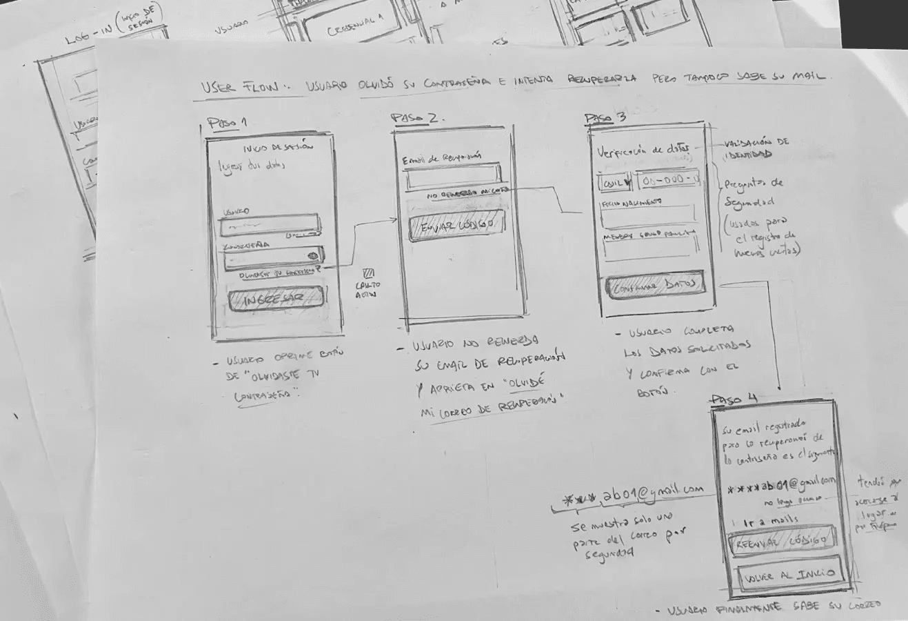
Users frequently forgot the email address associated with their account, making the existing password recovery flow ineffective
Account access relied on a centralized registration code that many users didn’t have or didn’t remember
An alternative login method (“Mi Argentina”) was available but poorly understood, resulting in low adoption and trust.
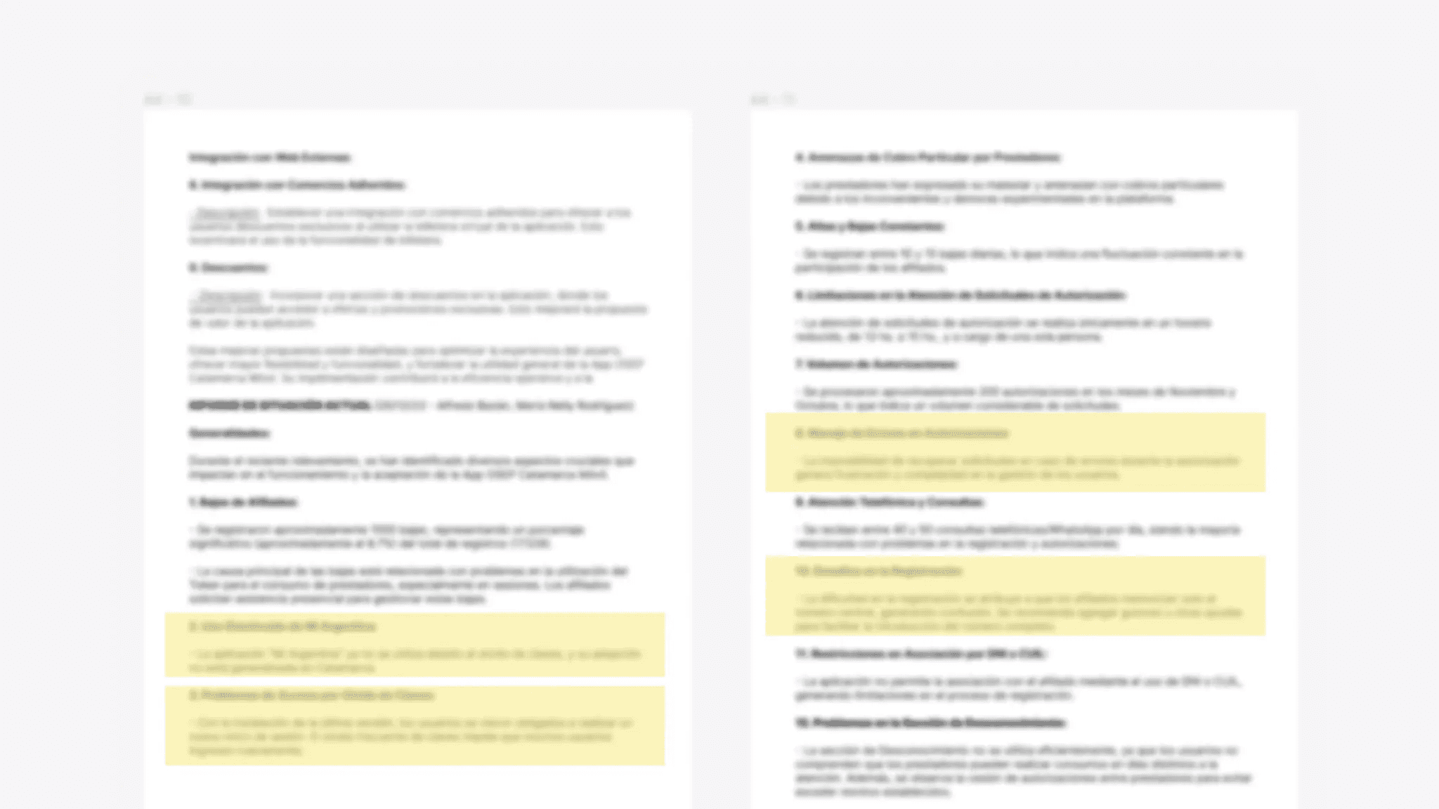
The document below is the app’s baseline audit I requested to assess our current standing. It covers usage statistics and insights into the affiliate-provider relationship, based on research by our client-facing lead. Content is blurred for confidentiality.
Approach and Key Decisions
Research & Analysis
Due to a lack of direct access to end-users, I requested an extensive baseline audit of the current app and its technical constraints. I conducted a competitive analysis and an exploratory audit to uncover visual and functional inconsistencies, using these insights to drive the new product strategy.
Strategic Prioritization & Core Improvements
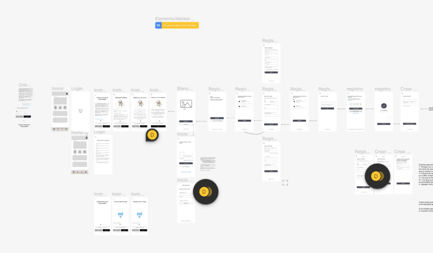
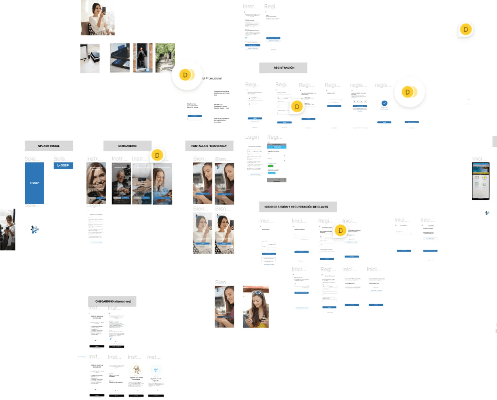
Faced with various competing priorities, I strategically focused on the new app launch by designing a tailored onboarding experience to communicate the update and clarify new access points. We prioritized critical friction points, such as the password and email recovery flows, while executing a comprehensive visual refresh to modernize the interface and align it with current user expectations.
UX & Information Architecture
Evaluated multiple access methods—including social login and phone-only authentication—while redesigning the registration and password recovery flows. I also structured a clear onboarding sequence to guide users through the new interface and simplify their first access.
Product Collaboration
Collaborated with the company owner to align design goals with long-term business objectives. I worked closely with the Project Lead and the Lead Developer to iterate on technical details, ensuring the project was fully defined and ready for the development phase.
Prioritizing access and onboarding
I focused on reducing entry friction by:
improving recovery flows
Introducing onboarding explanations
clarifying registration requirements
Regarding Key Insight 1 and 2
To address this, I introduced a “I don’t remember my email” flow, allowing users to verify their identity through critical personal data already present in the system.
Once validated, the system revealed the correct recovery email, enabling users to continue with the standard password reset process.

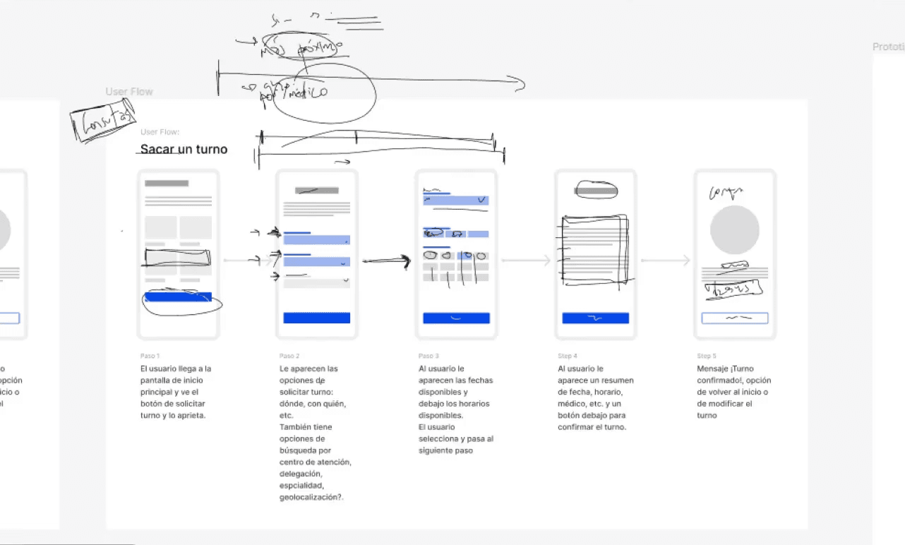
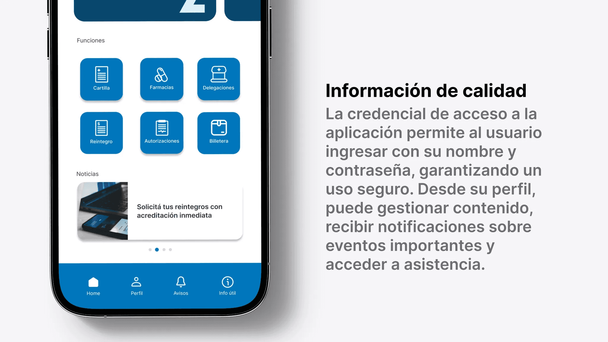
Restructuring navigation
The home menu was reorganized to:
surface core actions first
reduce cognitive load
align with common user goals
Visual alignment
A full aesthetic refresh ensured consistency with modern UI standards while respecting system constraints.

Learnings
Even limited user input can surface high-impact usability issues
Early design work can create strong business momentum
Opportunities for Improvement
Next Steps
Validate improvements with usage data
Iterate based on retention and completion metrics post-launch