Industry

Healthcare

Client

Tekhne

Year

2024

Digital Bonds

The Challenge

The main challenge was to design a fast yet usable solution within a very limited timeframe—just two weeks. The goal was to introduce Mis Bonos, a new feature that would allow users to purchase vouchers online, complementing the existing in-person process. This was also the client’s second attempt at launching the feature, following a previous, unsuccessful version developed by another provider. We had to work with the context and limitations of that earlier attempt while making sure this version better addressed user needs and aligned with business objectives—all under significant time pressure.

The Outcome

Registered Users

+163%

Registered users grew from 80,000 to 237,000, a nearly 3x increase after the launch of the new feature

Registered Users

+163%

Registered users grew from 80,000 to 237,000, a nearly 3x increase after the launch of the new feature

Registered Users

+163%

Registered users grew from 80,000 to 237,000, a nearly 3x increase after the launch of the new feature

Early Adoption

+68.000 tickets bought first month

Just one month after the release of the Mis Bonos feature, users had already purchased:. This early adoption demonstrated strong user interest and confirmed the demand for a more accessible, online experience—validating both the design and the product strategy.

The Process

Discovery phase

Discovery phase

Discovery phase

User Research and Data

It’s important to highlight that, while this functionality might seem simple at first glance (purchasing vouchers online), it involves a layer of complexity due to the variety of voucher types, quantities, and how they are organized. This complexity arises because the available options depend on who is purchasing the voucher (e.g., the account holder) and who will be using it (e.g., family members).

Discovery phase

Discovery phase

Discovery phase

Insights

The app needed to be extremely simple and lightweight to meet launch deadlines and work with basic tech infrastructure

Given technical constraints and the urgency to deploy, the design had to prioritize clarity, performance, and essential functions only. This limited the use of complex flows or custom logic, shaping the product strategy around simplicity and core value delivery

There were three different voucher types, each with its own price and quantity — requiring clear differentiation and guidance in the purchase flow

Users had to choose between multiple voucher types, each serving different purposes with different pricing. Without clear visual and textual distinction, confusion could arise during selection

Primary users could purchase vouchers not just for themselves, but also for dependents

The app needed to support multi-user management, where one account (typically a parent or caretaker) could buy vouchers on behalf of others. This introduced additional complexity in terms of user selection, purchase tracking, and receipt attribution

Define phase

Define phase

Define phase

Define phase

Once we had a solid understanding of the fundamental concepts and requirements of the new functionality, we created updated user flows to explore the most suitable experience for purchasing vouchers. To support this, we used comparison tables to outline the differences between various scenarios. 
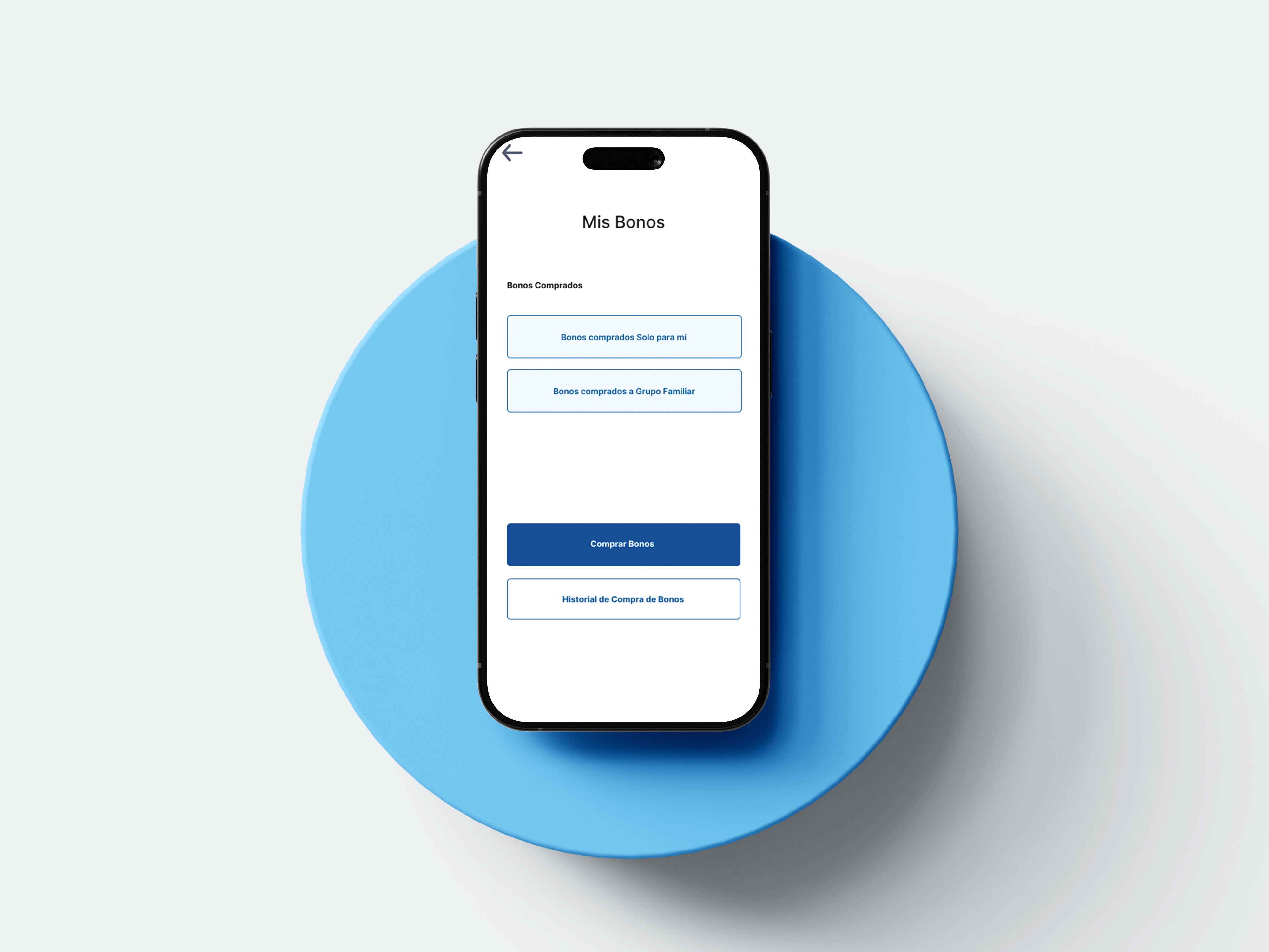
For example, depending on who was making the purchase, the system would show different levels of availability: the account holder could see all vouchers acquired, while other users—such as family members—could only view their own and not those of other members within the group.

Develop phase

Develop phase

Develop phase

Wireframes, Flows, Conceptualization

ITERATION 
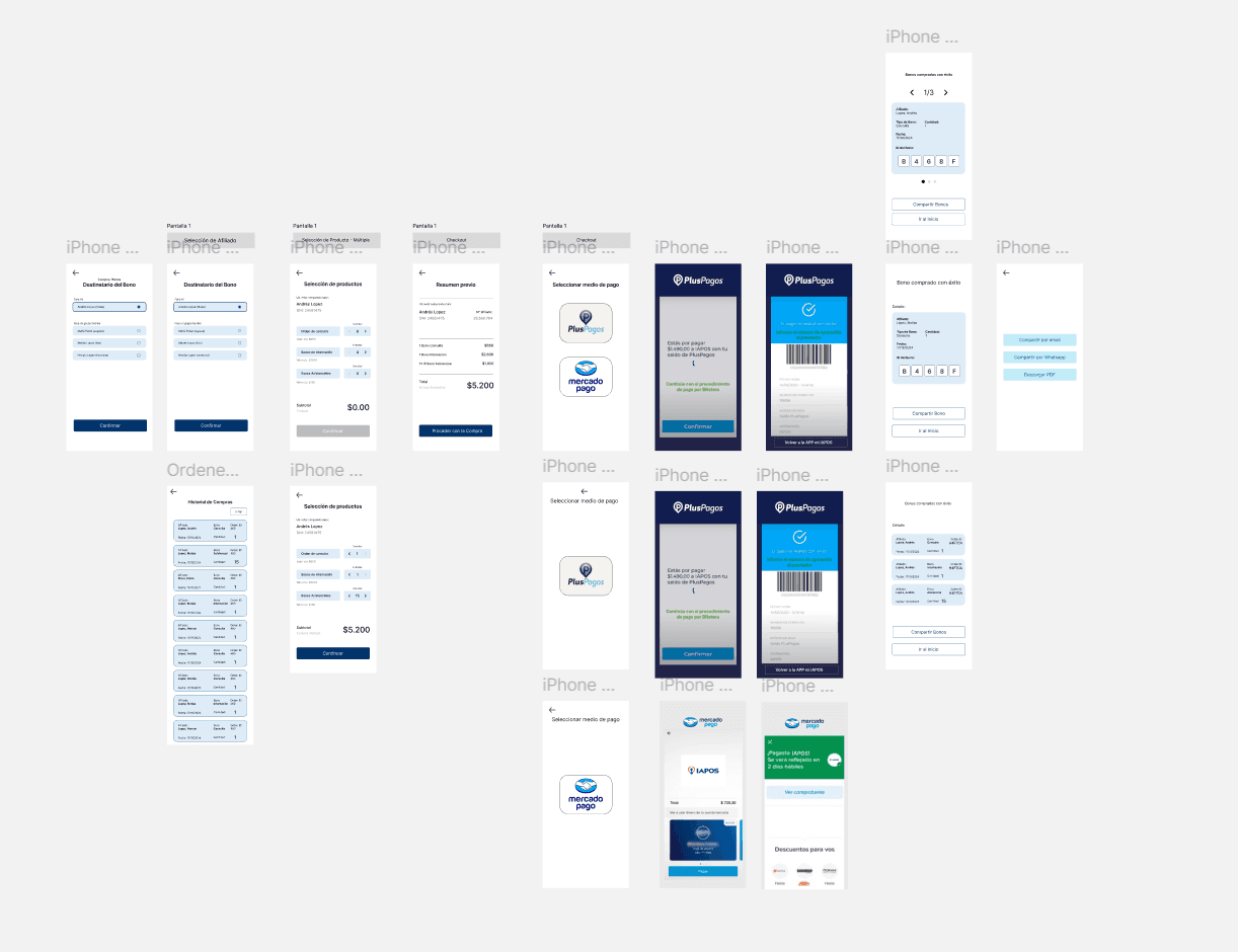
The voucher purchase process involved more than just selecting who the voucher was for—it also required choosing the quantity and type of vouchers to be purchased. Initially, the interface was designed around preselected voucher types, but after several meetings and gathering more insights, we learned that users frequently purchased more than one type of voucher at a time. As a result, we redesigned the purchase interface to support multi-selection, allowing users to choose multiple types and quantities of vouchers within the same screen. In this context, it was also important to include clear indicators such as the price per voucher type and a subtotal to show the total cost of the upcoming purchase. Once development began, we carried out a feedback loop between design and engineering, which allowed us to adjust the designs to better align with the technologies in use. It’s worth noting that due to technical constraints, some elements had to diverge from the original design. However, the key was to ensure that core functionalities were preserved—at least in this first stage. 
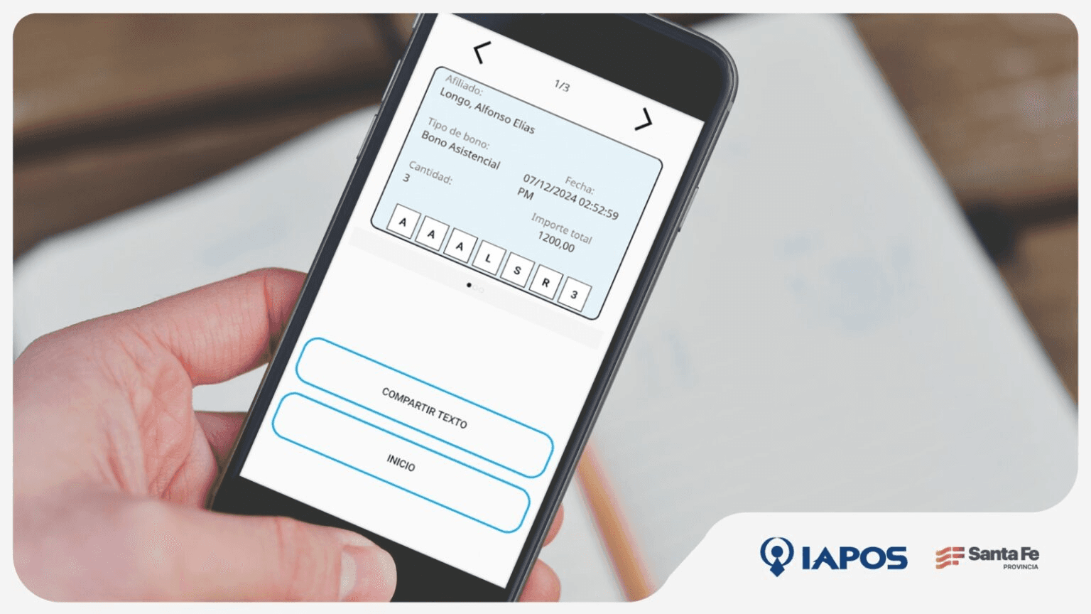
After development and implementation, the new functionality was integrated into the application and is now fully operational. Below is promotional material shared by the client to encourage the use of this new feature.

Develop phase

Develop phase

Develop phase

Unfolding the solutions

Key Learnings This project offered several valuable lessons. First, working with tight deadlines pushed me to become more agile and decisive throughout the process. I also learned to be more flexible with pixel-perfect design expectations, understanding that some elements would inevitably change during development due to technical constraints. Most importantly, I experienced how simplicity is often the result of iteration—many of my initial design ideas only became truly effective after multiple rounds of feedback and refinement. Areas for Improvement Looking back, there are several areas I believe could be improved. I could have designed more robust error states and worked further on microinteractions to elevate the overall user experience. I also see room for improving the testing phase, to better anticipate and catch functional issues before launch. On the client side, one challenge was the limited promotion and infrastructure around the use of the vouchers. Several user reviews mentioned poor adoption by the institutions meant to accept them. While this was outside my direct control, it highlighted the importance of considering service design holistically, beyond just the digital product. Lastly, I believe it would have been valuable to push for the inclusion of more user metrics. Having measurable indicators of user satisfaction would have helped us better understand the product's impact and identify clearer areas for iteration.