Insurance Health App Redesign
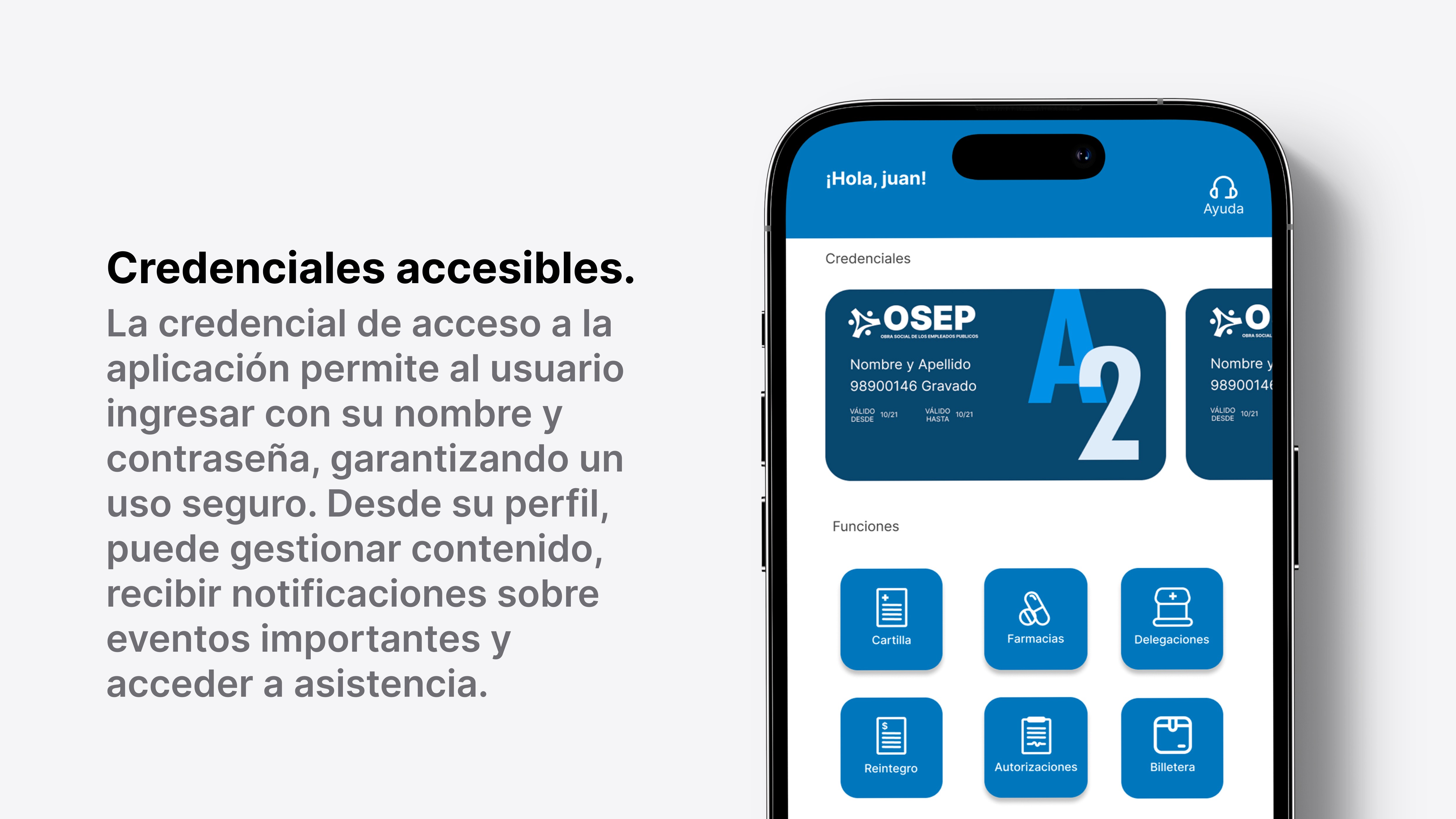
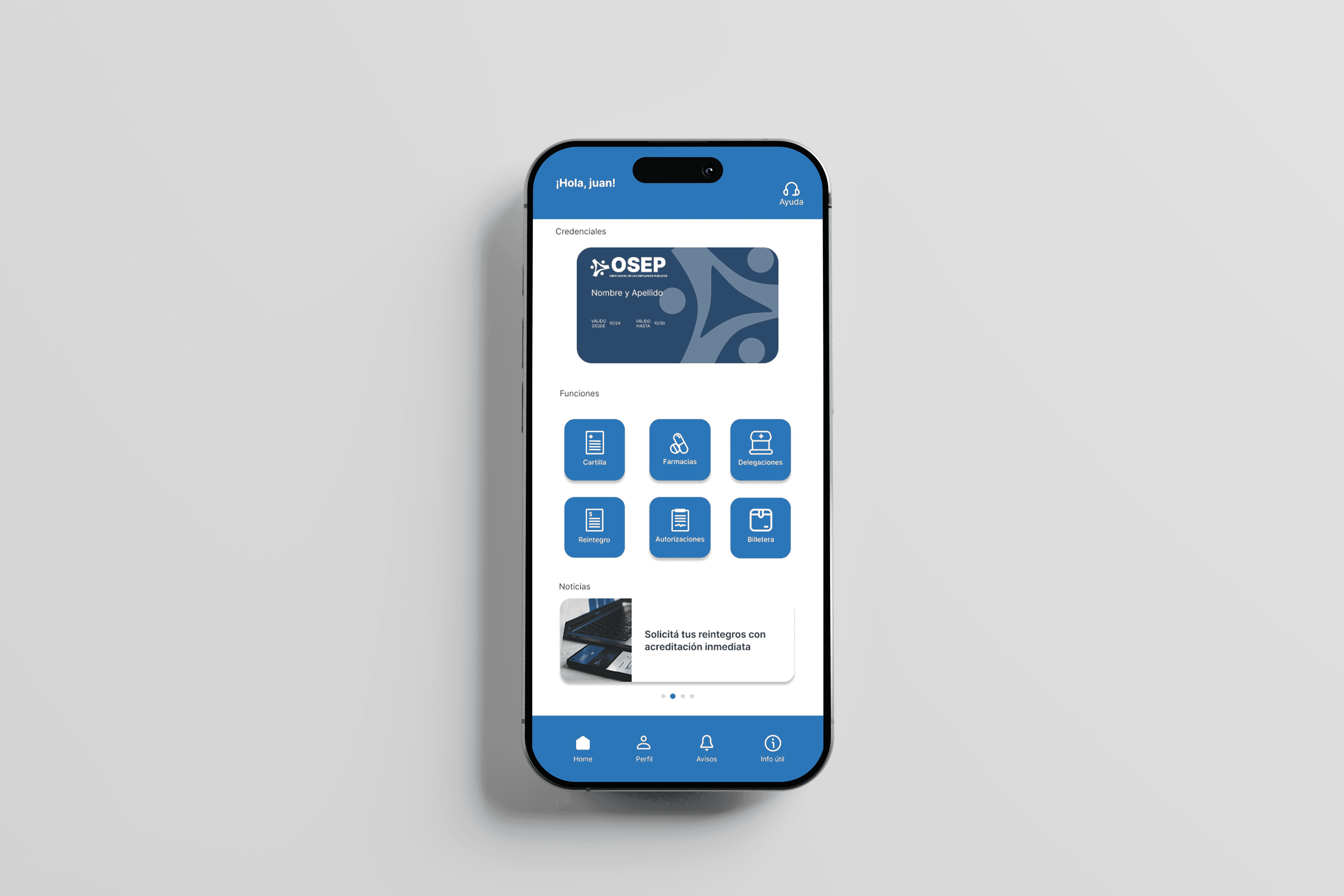
This app serves as a comprehensive tool to manage their health coverage, access vital information, and utilize a range of services provided by their health insurance provider.
The Challenge
This company had an old app which was designed and developed by the engineering team ( there was no design team). Tekhne hired me and my colleague to handle the design for this app and many other projects, that is to say that were the only and first designers there, there was no documentation whatsoever for this product. So we started from scratch.
Considering the fact that there was already an existing app, the challenge was to asses it, and redesign it for a better experience.
The Outcome
Client Adoption Interest Pre-Release
+4 clients
Four clients requested the redesigned app before it was even built, demonstrating clear market demand and strong perceived value from early design presentations or prototypes
Client Adoption Interest Pre-Release
+4 clients
Four clients requested the redesigned app before it was even built, demonstrating clear market demand and strong perceived value from early design presentations or prototypes
Client Adoption Interest Pre-Release
+4 clients
Four clients requested the redesigned app before it was even built, demonstrating clear market demand and strong perceived value from early design presentations or prototypes
Reg. Completion Rate (expected)
Once released, this will measure how many users successfully complete the registration process after the improvements.
Reg. Completion Rate (expected)
Once released, this will measure how many users successfully complete the registration process after the improvements.
Reg. Completion Rate (expected)
Once released, this will measure how many users successfully complete the registration process after the improvements.
User Retention Rate (expected)
Once released, this will show whether users are staying engaged after initial use, likely influenced by better navigation and onboarding.
User Retention Rate (expected)
Once released, this will show whether users are staying engaged after initial use, likely influenced by better navigation and onboarding.
User Retention Rate (expected)
Once released, this will show whether users are staying engaged after initial use, likely influenced by better navigation and onboarding.
The Process
User Research and Data
To inform our design decisions, we conducted a mix of exploratory research and data analysis—despite some constraints in access and resources.
We had limited opportunities to engage with end users and client administrators directly, due to both budget limitations and the lack of an established user research process. However, we managed to gather valuable insights through informal conversations with a few stakeholders and internal team members who had client-facing roles. These discussions helped us understand major pain points and user needs from a high-level perspective.
We also carried out a exploratory research, including competitor analysis and ux evaluations, to establish a baseline for usability and design standards.
Insights
From our research and data analysis, we uncovered a few key insights that guided the redesign.
Users struggle to log in due to forgotten usernames, leading to frustration and trial-and-error behavior.
Many users could not remember the email address they registered with and attempted multiple addresses before giving up or contacting support. The system offered no support for recovering or confirming the username, resulting in a high-friction entry point.
The registration process created unnecessary barriers by requiring a centralized code users often didn't know
New users were blocked from registering because the app required a central number that was neither clearly communicated nor easily accessible. This created a perception that the system was “not for them.”
Login via “Mi Argentina” is underutilized due to low awareness in the province
Although available as an authentication method, users rarely chose to log in with “Mi Argentina” because they were unfamiliar with it or did not trust it as a login channel
Login via “Mi Argentina” is underutilized due to low awareness in the province
Although available as an authentication method, users rarely chose to log in with “Mi Argentina” because they were unfamiliar with it or did not trust it as a login channel
Login via “Mi Argentina” is underutilized due to low awareness in the province
Although available as an authentication method, users rarely chose to log in with “Mi Argentina” because they were unfamiliar with it or did not trust it as a login channel
Define phase
In this phase, we focused on organizing the main problems based on the limited user feedback and data available. Our goal was to clarify key pain points and set straightforward priorities for the redesign, giving us a clear direction before moving into design solutions.
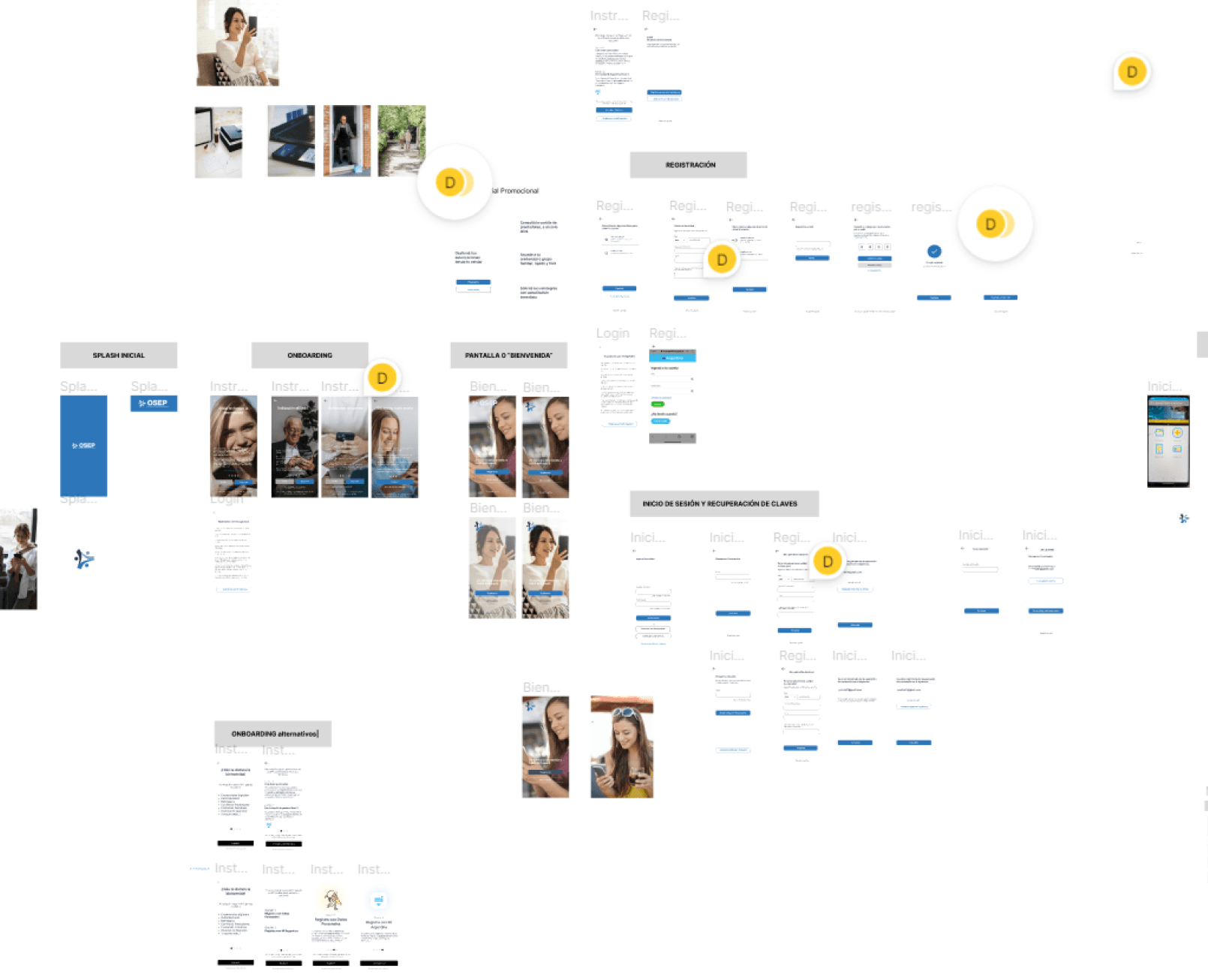
Wireframes, Flows, Conceptualization